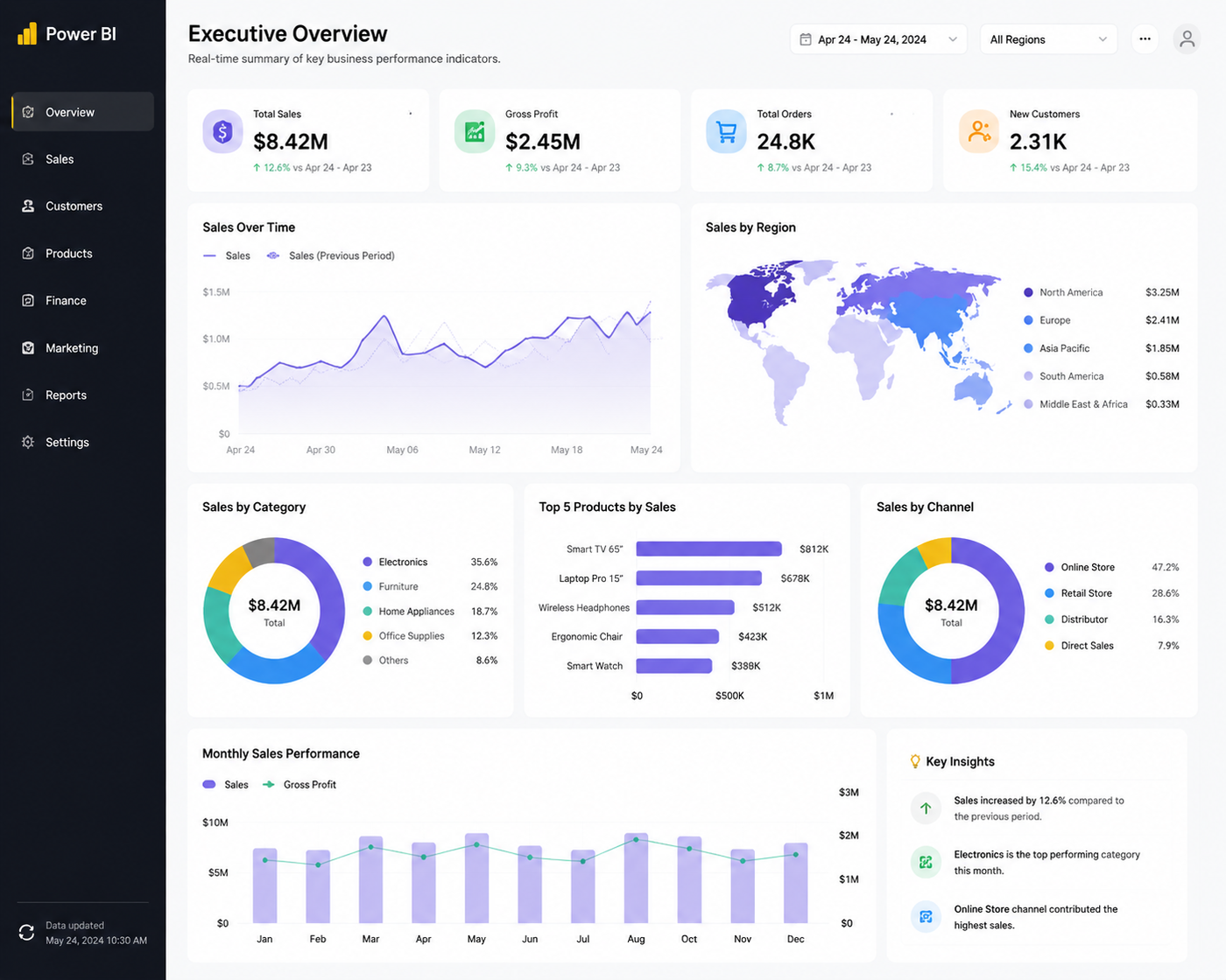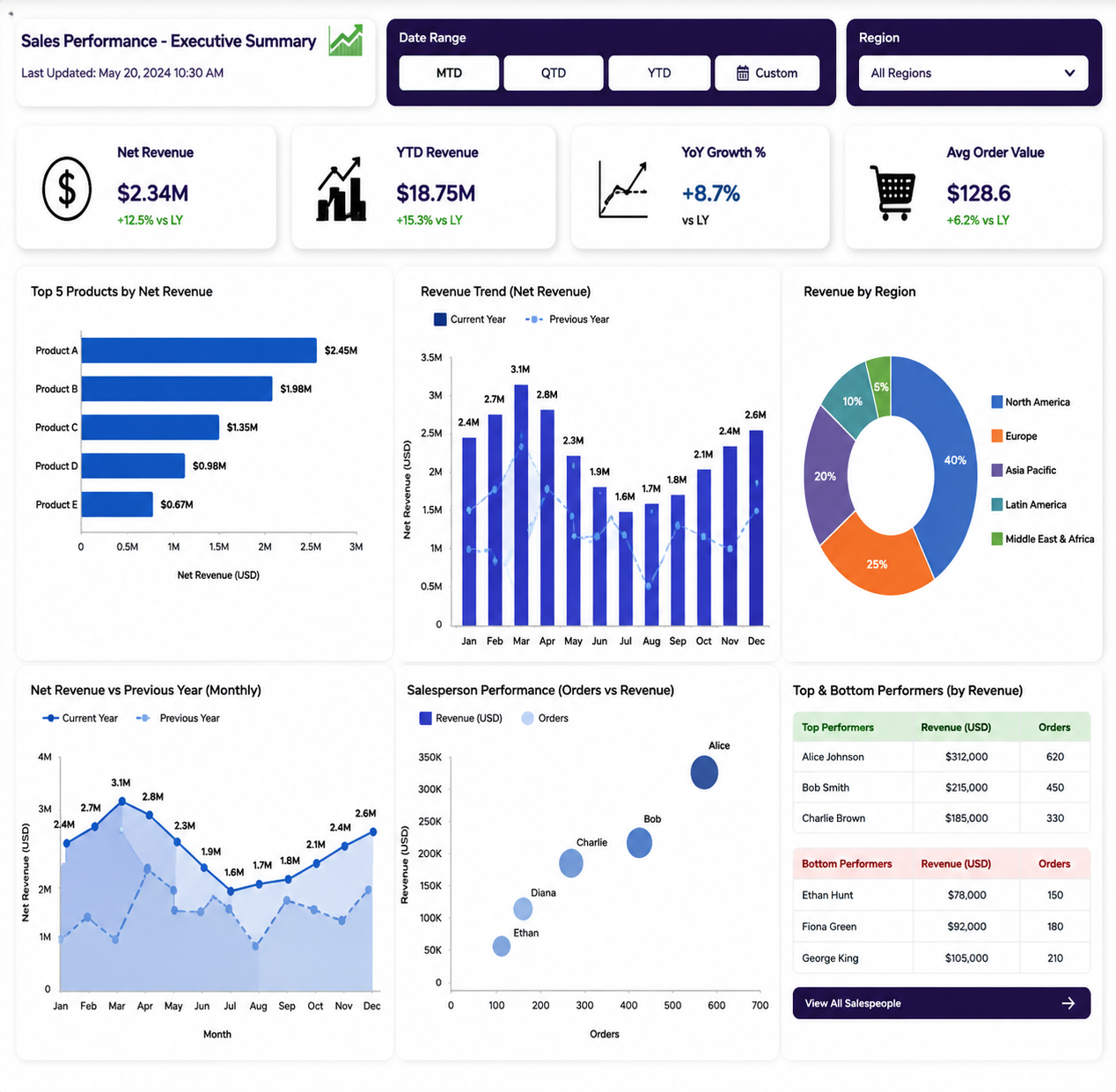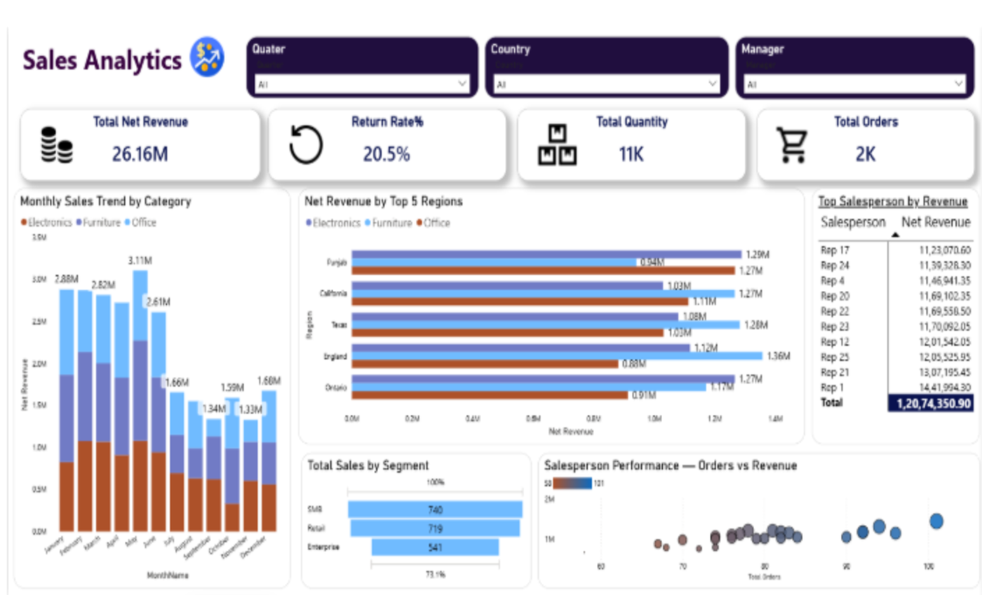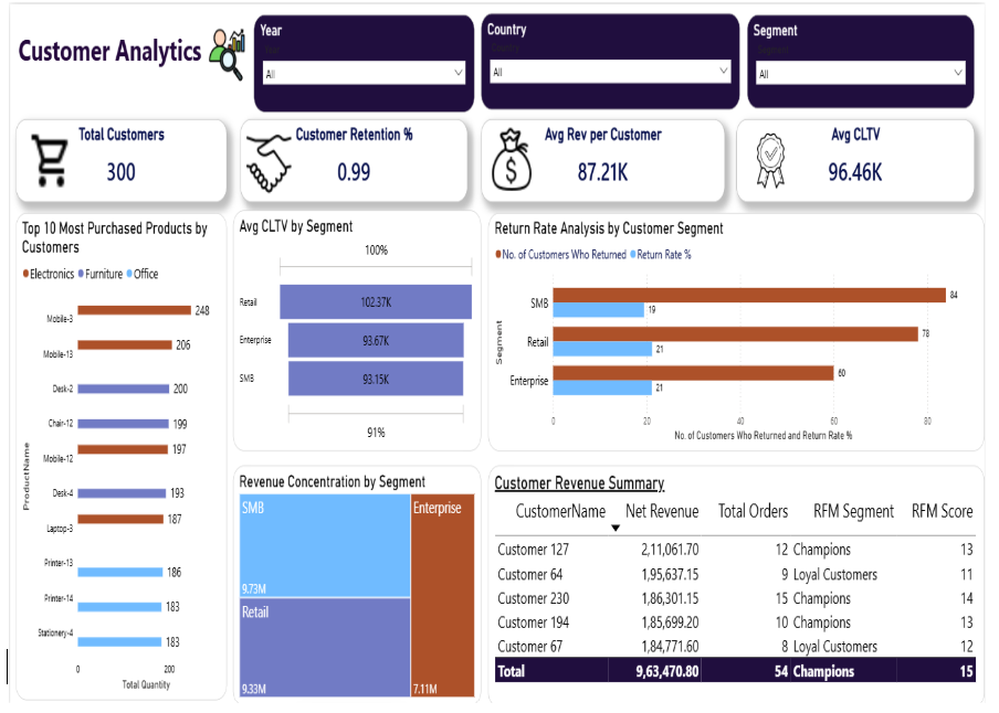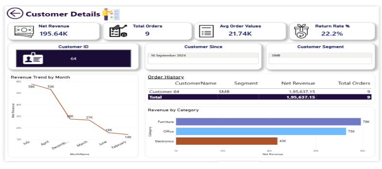
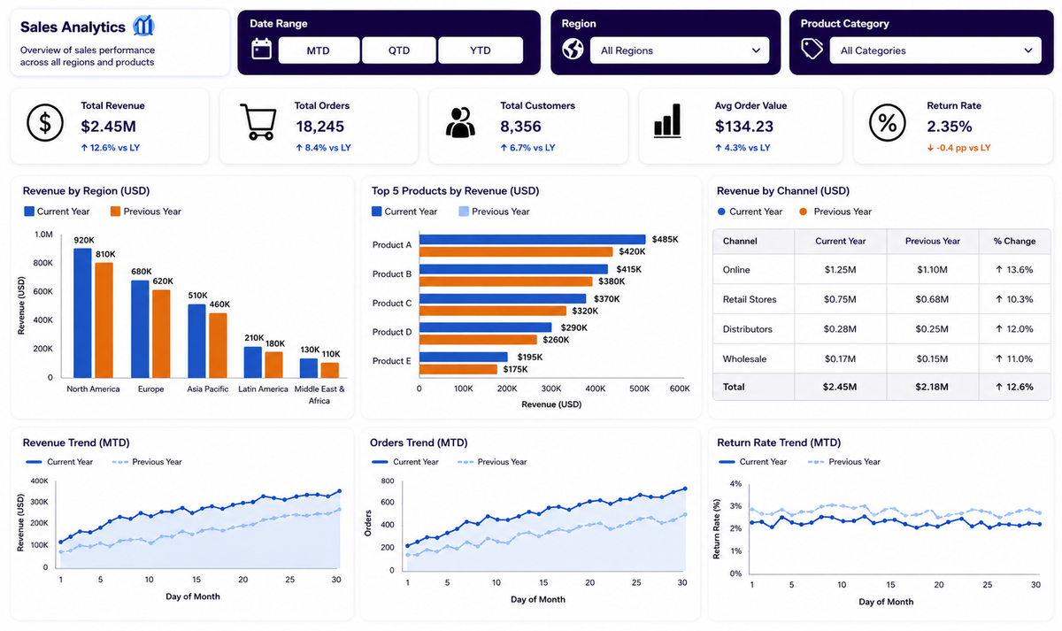
This dashboard suite is an end-to-end Power BI analytics solution built to unify sales, customer, and product performance data for a multi-category retailer spanning Electronics, Furniture, and Office products. It consolidates data from five countries and multiple sales channels into five interconnected report pages i.e. Executive Summary, Sales Analytics, Customer Analytics, Product Analysis, and Customer Details. Together, these pages track over ₹26M in net revenue, enabling leadership to move from scattered spreadsheets to a single, real-time source of truth. The result is faster, evidence-based decision-making across revenue, retention, returns, and product profitability.
Power BI Desktop, Power Query Editor, DAX Studio, Excel/CSV & SQL Server data sources, Power BI Service for publishing and sharing
Sales, order, and customer data were scattered across countries, categories, and sales teams with no unified reporting layer. Leadership could not easily answer basic questions which regions were underperforming, which customers were most valuable, or why the return rate sat at a notable 20.5% because the raw data lived in disconnected tables with no consistent definitions of revenue, orders, or customer segments.
Raw transactional data was ingested and cleaned in Power Query, then modelled into a star schema with a central Orders fact table linked to Customer, Product, Region, and Date dimension tables. Core DAX measures - Net Revenue, YTD Revenue, YoY Growth %, Average Order Value, and Return Rate % were built once and reused consistently across all five report pages, ensuring every number on every page told the same story.
Beyond standard KPI reporting, the solution layers in an RFM (Recency, Frequency, Monetary) scoring engine to classify customers into Champions, Loyal Customers, and other segments, alongside a Customer Lifetime Value (CLTV) model. A discounting-impact waterfall compares gross Revenue against Net Revenue by month, while a salesperson performance bubble chart correlates order volume against revenue to surface top and underperforming reps at a glance.
The model was refined iteratively: 2025 vs 2026 trend comparisons were added to validate seasonality, return-rate thresholds were recalibrated by category and segment as new data arrived, and drill-through paths from summary visuals to the Customer Details page were tuned based on how stakeholders actually explored the data — improving both accuracy and adoption over time.
“Accuracy in a dashboard isn't about a single formula, it's about every measure agreeing with every other measure, no matter which page you're standing on.” — Tamanna Thakur, Data Analyst
Enhancing Accuracy in Sales & Customer Performance Tracking
The dashboard suite combines financial KPIs, customer intelligence, and product-level detail into one governed data model, so every metric from Net Revenue to Return Rate % is calculated once and trusted everywhere it appears.
What began as a set of static sales reports has evolved into a connected analytics ecosystem capable of both explaining the past and guiding future action. Extending it with AI is the natural next step in that journey.